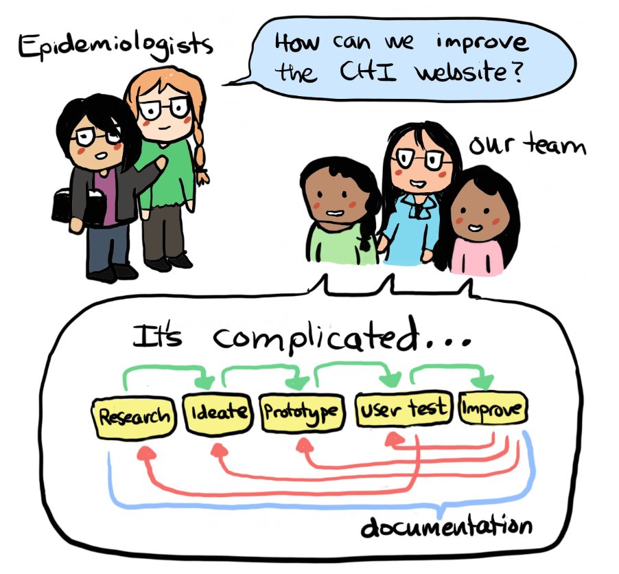
Community Health Indicators: A Design Approach

Sandy Li, Pranavi Midathada and Felcy Selwyn

Abstract

The Public Health Department of Seattle and King County maintains a comprehensive collection of data called the Community Health Indicators (CHI). These indicators measure health behaviors and health outcomes of King County residents. The CHI online open data portal draws a broad range of users, including researchers, non-profits and policy-makers. The website content is used for grant applications, reports, policy and outreach programs that benefit the community, among other things. Our project focuses on ways to improve upon the CHI website, since users of the site reported difficulties navigating, finding and understanding information presented on the website. To help users, we utilized a user-centered design approach to create a three-part solution: 1) information reorganization and tagging, 2) video tutorials, and 3) data visualizations.

Organizational Background

Our capstone team is working with a unit of the Department of Public Health of Seattle and King County (PHSKC). King County is one of the largest counties in the country, home to 1.9 million people of diverse backgrounds across urban, suburban and rural neighborhoods. PHSKC is a government institution that aims to serve the public and collaborate with hospitals and other community and outreach programs. Some issues the department addresses are chronic disease prevalence, food safety concerns, emergency preparedness, injury prevention, just to name a few (“Public Health - Seattle King County”, n.d).


Within this department, our capstone team is working with the Assessment, Policy Development & Evaluation Unit (APDE). There are currently 33 employees working as a multidisciplinary team, consisting mainly of epidemiologists and social research scientists (“Online Directory”, n.d). The main goal of this unit is to aid other groups such as the public, other government departments and community outreach programs in understanding and accessing public health data to access the current situation, identify problem spaces, and evaluate program effectiveness within the realm of public health though data.

Information Problem


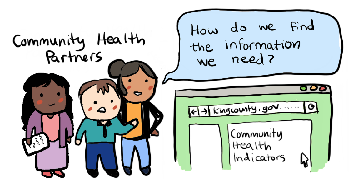
Our sponsors at the Department of Public Health manage a large amount of data and they are eager to share their information with their community health partners (researchers, non-profits and policy-makers), the media and the public. The Assessment, Policy Development & Evaluation Unit (APDE) has identified an issue with data accessibility and data literacy where users are unable to identify and access the datasets that they are looking for due to the rigid and industry specific organization. The user may become frustrated with the data being dispersed throughout different websites/locations and not organized intuitively. Sometimes the situation transforms into one where the user submits a data request to the Department and the Department will have to solve the data accessibility problem in a case by case manner. Repeated failures creates a sense of “learned helplessness” in the user which can be solved by better design (Norman, D, 2013). The user’s difficulties are signifiers of where the data portal can be improved.


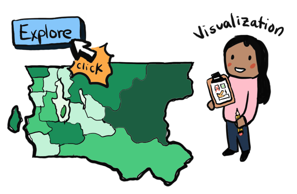
The Department of Public Health wants to use the aggregated open data that is present on their data portal to get the public interested in what is happening in their neighborhood, issues concerning their demographic group to empower them and encourage the use of the data for community projects. This goes back to their organizational mission of providing the leadership and technical assistance to help community partners develop data-driven community programs.

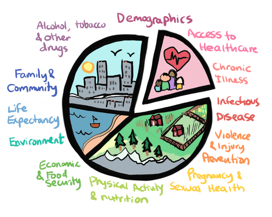
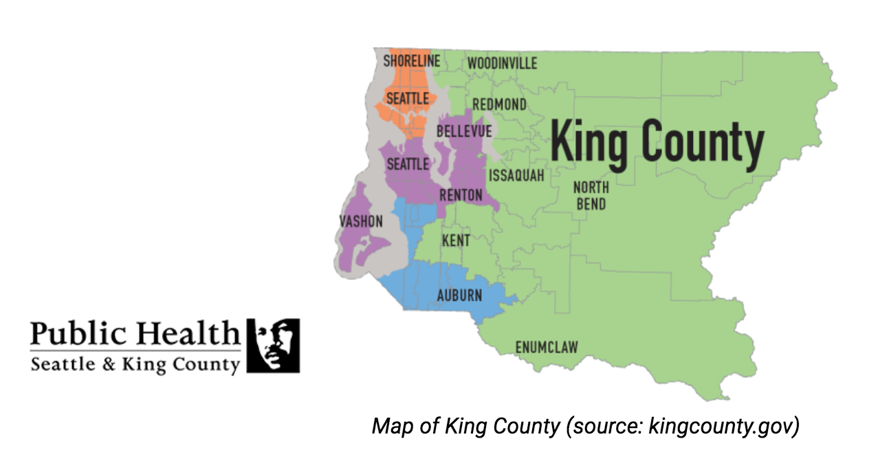
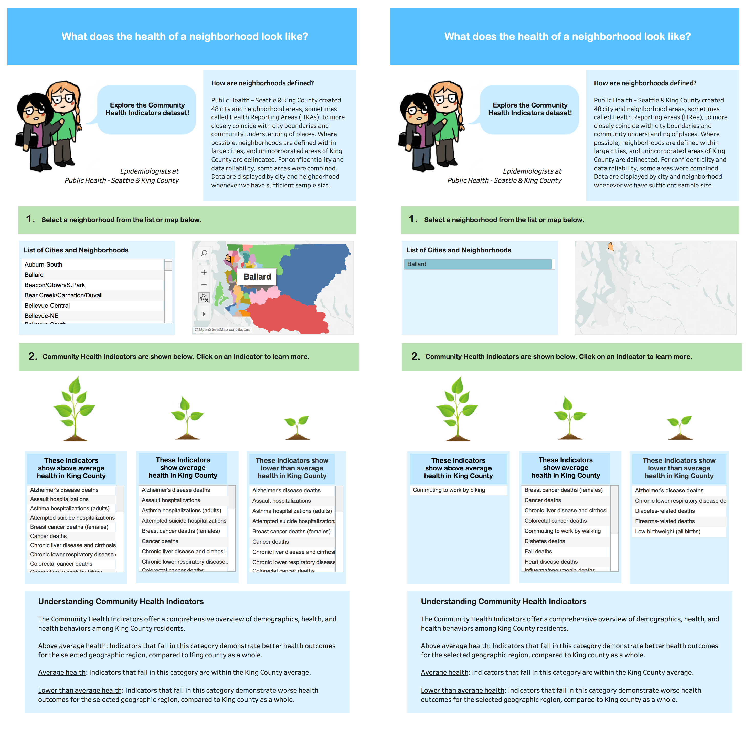
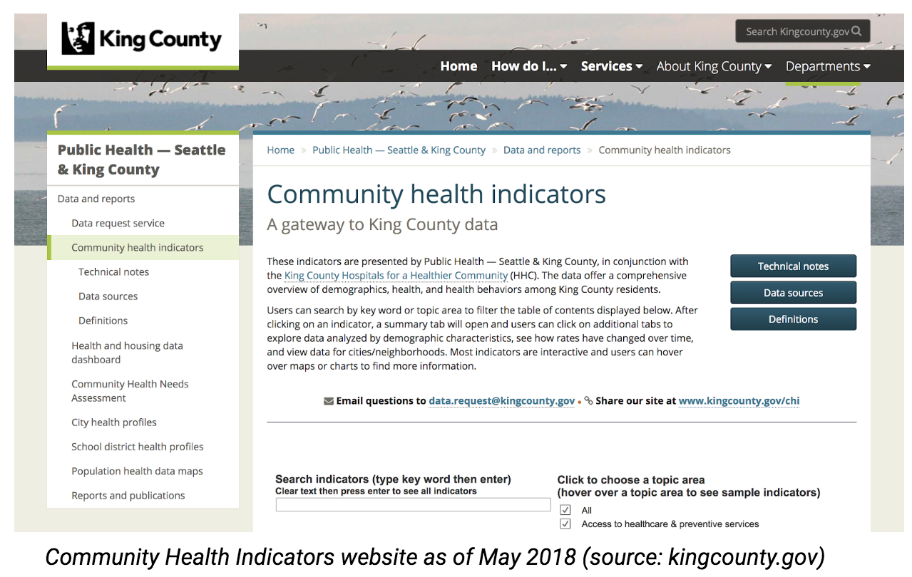
Our problem space involves the King County’s public health open data portal, the CHI website. These indicators offer information about the health of King county residents aggregated and archived over many years. The data is collected from the public through surveys and records from hospitals, schools and welfare programs. Epidemiologists in the Department of Public Health work to clean, aggregate the data, analyze,identify trends in the data and create visualizations from the data. The aggregated data and the visualizations are organized and stored in their servers and the King County IT department and Webmaster are responsible for organizing information and maintaining the content on the open data portal (CHI webpage).


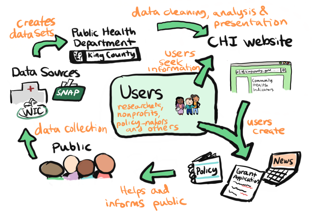
As the diagram indicates, the problem is centered around the users. Typical users who visit the CHI webpage seeking information are concerned citizens (public) and other users such as people from other government agencies, community organizations, health providers, non-profit organizations, media, advocacy groups, students, teachers, researchers and employers seeking information for creating employee wellness programs. These users seek information and data usually to create grant applications, informative articles/talks, course of action tasks and to create or evaluate existing policies. These would directly or indirectly benefit the general public.

Design Process and Methodology


While we were working on our solution, the website itself changed drastically from an accordion file structure of pdf tables to a set of Tableau dashboards. These changed pushed us to a user-centered design approach to understand what users want from the data portal. This included user research in the form of contextual inquiries, surveys, and card sorts that helped us future define our problem space and provide ideas on what to improve every step of the way.

For our contextual inquiries, we asked each user to show us what their typical workflow was like when they wanted to get data on the site. If they hadn’t work on the site before, we would provide a scenario based on their work and the data available. We asked them questions about their roles, backgrounds and values. After defining our problem space after analyzing the interviews, we narrowed it down to two major information issues: Organization and Literacy. From here, we took a three pronged approach to address these issues.


Solution 1: Reorganization and Tagging


This solution consists of three different approaches: card sort, proof of concept for faceted search, and a script to create tags for the current Tableau tables format of the website.

Faceted Search
Based on the contextual inquiry, we found that users wanted to be able to search for the indicators. After consulting various iSchool professors, we began to look into faceted search as a potential option. Due to the time frame, we executed a proof of concept and provided a documentation of our findings. We identified two different enterprise search platform: Apache Solr, and AWS CloudSearch. The two solutions were evaluated with a simple proof of concept that were judged based on a set of criteria. We chose this proof of concept based on anticipated workflow and potential use case. The proof of concept consisted of three main parts: set up initial server, test automatic schema creation with the combined ACS dataset and review process for manual schema creation for the combined ACS dataset.


Tagging Script
While faceted search would be the most comprehensive solution, it has a high time and resource cost. This led us to to build a custom script that would scrape demographics and geographic regions to allow users to be able to search with different terms. We wrote a script that aims to create tags based on the year and group that an indicator has data for. This will allow the current Tableau dashboards on the website to be linked by tags.

Card Sorts
We manually sorted the 164 health topics present on the Community Health Indicators Website twice and grouped the health topics into 15 broad category names and grouped some difficult topics (11 topics) into an 'Other' category. We then created 3 studies (30 health topics each to be sorted into groups), each study included the 11 difficult topics belonging to my "other" group as well as a few topics that belonged to 5 broad categories, to make up a total of 30 topics per study to be categorized. We had abou35 participants sort the health topics into categories. After consulting with the epidemiologists we analyzed our results in a way that is most beneficial for them. We made a table that showed 68 health topics and the frequency in which people associated them under the different categories. This will help them better organize the health topics.


Solution 2: Video Tutorials


The site is available to the general public and as a result has to accommodate a wide variety of backgrounds and education. The solution is catered towards users with limited background in technology or public health. The final set of video tutorials consists of 7 videos that takes the users from how to navigate the site to how to interpret the visualizations. We consulted public health librarians, conducted online surveys to test the effectiveness in order to create a more useful resource. The videos are broken down in simple topics and in individual short videos to accommodate the widest variety of users.

View the videos here.

Solution 3: Data Visualizations


Some questions website users have asked are, “How healthy is my community?” and “What does health look like for a certain demographic group in King county?”. A data visualization would be a great way to explore these kinds of questions. The current structure of the CHI website includes Tableau dashboards for each individual indicator. However, there is no visualization that brings together all indicators on the website in order to visualize trends across geography or across demographic group.

Our team discussed many different avenues for creating data visualizations; we chose to create them in Tableau because it is the platform APDE uses and it has many functionalities for visualizing data in creative and aesthetically pleasing ways. In order to create a visualization that ties all the indicators together, the individual datasets by data source were fed into R in order to be cleaned and grouped together into one larger dataset.

After cleaning the data and feeding it into Tableau, our team brainstormed many ways of displaying this information. We built a visualization that answers the question, “What does health look like in my neighborhood?”. The outcome depended on the commonalities between each dataset and ways the indicators could be grouped together. The image below shows the final visualization, with a before and after a geographic region is selected. The visualization filters the Community Health Indicators based on King County averages. Currently, this visualization is being assessed before being published on the Community Health Indicators website.


Impact

One of the direct impacts of this project is that it informs the team at APDE of different ways of managing their information. While the team at APDE have created an amazing resource for those interested in learning about public health in King County, the current iteration may be difficult of people to use. We have created reports, a script, videos, wireframes and documentation that will be useful in informing our sponsors of the directions they should take in managing the CHI dataset. Shared our results with team at data viz meeting and at a general unit meeting . Some of our solutions will have a more tangible impact (the script for tagging) since it can be implemented quickly. Our research on Solr vs. AWS will add to the knowledge base of the Assessment, Policy Development & Evaluation Unit and will be used as the base when and if they choose to implement the solution. The other deliverables are proofs of concept, which will be further discussed or improved upon before becoming an addition to the website.

This opportunity allowed our capstone team to learn a lot in the domains of information management and public health.

Our Amazing Team

Thanks for checking out our project!